Nearly every picture I compose has a bit of empty space. Many folks would say this is where a person may rest their eyes. And lately I’ve come to try and think of the empty space as being a main character like any of the other objects in my picture. Yet invariably I work hard to fill up all the spaces in my composition. Why must I do this? One of my favorite art mentors teased me claiming I had a fear of empty spaces. And frankly I agreed with her. A part of me thinks that is where the picture is boring. It is a dead spot neither moving the eye along or being interesting enough to have one linger there. But I know this is just me and my empty space phobia talking.
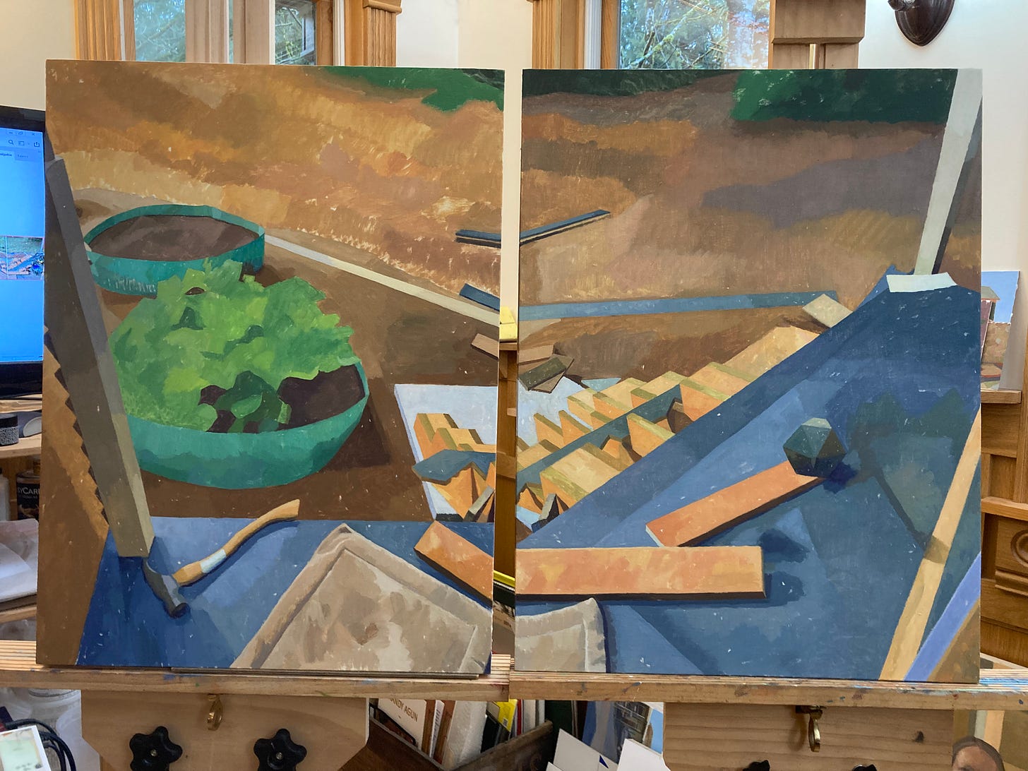
So here is a current diptych I’m working on. You may notice that the two panels are at different perspectives as I had to look down in front to capture the left scene and down to the right to capture the right scene. I discussed this issue of changing perspective as one turns one’s head to take in a whole space in a previous newsletter. This is one way to handle it and I love the effect it has on the picture.
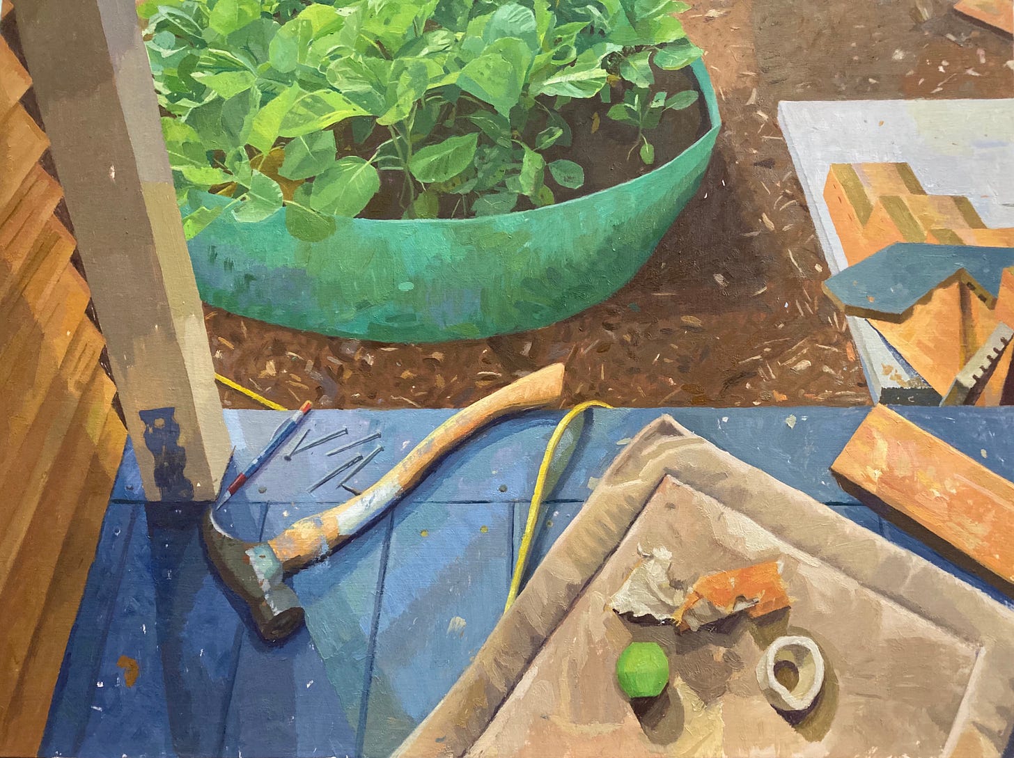
Off the bat the empty space I knew would bother me is the grassy area at the top part of each panel. (This was summer at a time when our grass was mostly brown and didn’t need mowing much to my husband’s delight.) The right panel has a bunch of tools and stuff all mangled together as this was a construction site for our porch. So to balance that I knew I’d be putting dog toys on the left where her bed is. I wouldn’t want that bed to stay empty now would I? And I’d add a bit more to the porch on the left as well. It seems a little too bare.
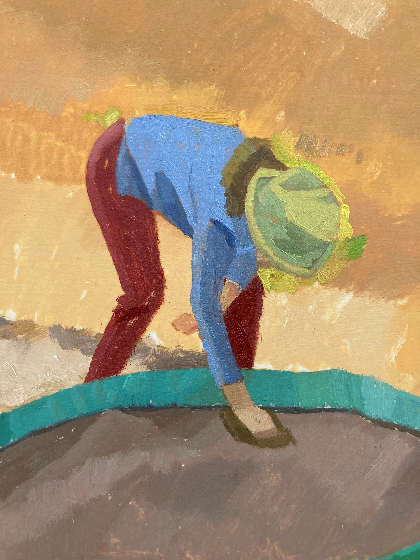
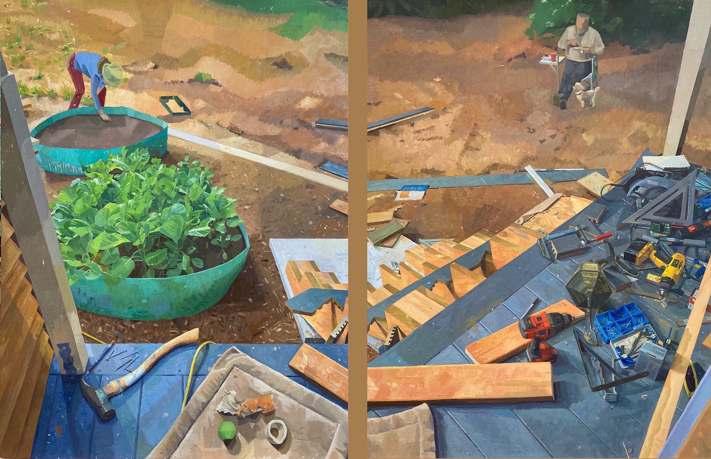
So to handle the upper part of both panels I decided to add a figure in each somewhere toward the top and small enough to leave quite a bit of space left over. I was going to roll up my sleeves and tackle that left over space!
The figures provide the human element that I love in pictures and help balance the bottom portion which currently weighted the composition too much for my taste. After having blocked them in I endeavored to work on the EMPTY SPACE that is the ground with bits of green. After a feeble attempt to paint some of the green bits in on the left panel I decided each needed another course of brown parts. I looked hard and saw geometric shapes of slightly different colors and values which helped break up this space and provide a meatier foundation for the greens to go on top. Right now I’ve left things fairly naturalistic. In the future here is where I’d like to grow my artistic vision and solve my fear of empty spaces. What if I exaggerate those geometric shapes a bit so they stood out as a sort of abstract design? I could push things to where I’m even making some color and shapes up reacting spontaneously to the needs of the picture. (Although spontaneous does not equate to speed as discussed in my last newsletter.) I may choose to try some of these ideas on this diptych. I mean it beats having a boring space right?
Now that I’ve gone on about my personal phobia regarding empty space in my pictures I do recognize that some artists handle them very well. Look at Rothko for instance. Or some of Edward Hopper’s paintings. And also empty spaces may have interesting things such as my different soil colors and green bits in the ground of my diptych. And one can choose to liven up the brush strokes going different directions in these spaces to make them more exciting. But my respect goes to those who can paint an empty space with a single color and value and just leave it. They have decided that is what their picture needs and have the discipline to restrain themselves. I’m in awe of this!
Here is where my diptych is now. I’m far from done with both figures needing more development, putting on the greens and adding a bit of sawdust to the porch. And then going over everything to see what needs something.
Folks if you are interested in purchasing or seeing more of my work please visit my website at www.brandyagun.com.


